
| Site Info: | Favorites: | C++: | Fun: | Newer Stuff: | Old Fun: | Old Tech: | Old Other: |
| News | Rating System | MinGW Distro | Image Hacking | SF Reviews | Origami Polyhedra | bwtzip | Quotations |
| Stephan T. Lavavej | Paper Airplane | Random Work | Book Reviews | ||||
| Deus Ex | PNG | Downloads | |||||
| Anime/SF | Mersenne Primes | Wallpaper | |||||
| Foundation | Diet |
|
|
|
Getting started.I'll refer to Photoshop 6.0.1 here, but my comments should be valid in general (in fact, I used 5.5 originally). This assumes a very minimal knowledge of Photoshop.First, I turned off all the layers in the Northwood logo image except the background, and then I stretched it to 1600x1200 (were I doing this again, I would create an even larger master image, but at least I had the presence of mind to create a 1600x1200 master). To do this, I used Image > Image Size..., turned off Constrain Proportions, set the Width to 1600 pixels and the Height to 1200 pixels, and made sure the resampling was Bicubic (not that it mattered, given what I later did). This produced (resized 1/4 in both dimensions here): |
 |
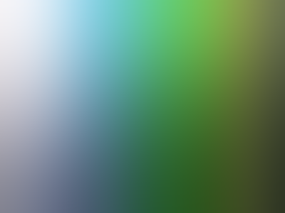
| Obviously, this wasn't a suitable background. So we use Filter > Blur > Gaussian Blur... with a radius of 250.0 pixels to smooth things out. Then we use Filter > Blur > Motion Blur... thrice with an angle of 90 degrees (vertical) and a distance of 500 pixels to make things more smooth in the vertical direction. It doesn't really matter what I did. If we do these exact steps again, we get (again resized 1/4 in both dimensions here): | 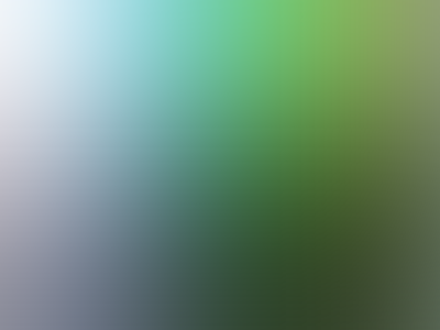 |
|
Actually, I forget exactly what I did. I did a lot of tweaking to get things exactly right, but since I'm just illustrating what I did here, and not giving a step-by-step guide to reproducing pixel-by-pixel the Northwood wallpaper itself (which I can't do), this will do. I did save a copy of the background once I finished getting everything just right. It looks like: I guess that's close enough. I'll use this image from now on. |
 |
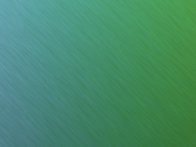
Preparing the background.We want to create the "streaky blur zoom" effect as seen in the final wallpaper. First, we use Filter > Brush Strokes > Sprayed Strokes... with Stroke Length 20, Spray Radius 25, and Stroke Direction Left Diagonal. This creates an interesting texture effect (and eliminates artifacts of the Gaussian blurring we did before). Here is a region from the resulting image (not resized down): |
 |
| Now we want to abuse the Filter > Brush Strokes > Angled Strokes... as a sort of "directional sharpener". Using Direction Balance 0 (so that the angled strokes go down to the right), Stroke Length 20, and Sharpness 10 (this is a matter of taste), we add more detail to the background and make it much more pleasing to look at. With the Sprayed Strokes we gave the image detail, but it was flat, blurry detail. The Angled Strokes sharpens things up without creating nasty artifacts. Here is an actual-sized region from the resulting image: | 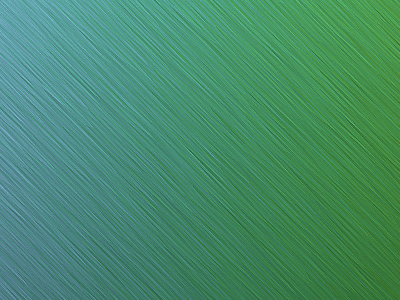 |
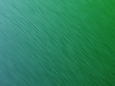
| Now, we create a new layer on top of the old one, and copy the old layer's image to the new layer. (Layer > New > Layer..., do not Group With Previous Layer, Color None, Mode Normal, Opacity 100%; Select > All; Edit > Copy Merged; Edit > Paste.) Now, with the new layer selected, we use Filter > Blur > Radial Blur... with amount 20 (a matter of taste), Blur Method Zoom, Quality Best. Here's the actual-sized central region: | 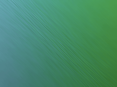 |
|
The zoom effect is very nifty, as it keeps the image rather sharp on the diagonal but blurs the other diagonal. To add more sharpness to the image, we use Angled Strokes again but this time with Stroke Length 3 and Sharpness 5 (again, a matter of taste). Now, to retain some of the original detail before the zoom, we set the zoomed top layer's opacity to 83%. In this manner, you can see how I created the Northwood background. (The actual process involved some tweaking of levels, as well as noise added at various parts, etc. It's not a process I can exactly duplicate at will, and besides - I can't let you have all my secrets, now can I? The fun of playing with Photoshop is inventing things on your own, not slavishly following a cookbook guide.) So from now on, I'm going to use the actual Northwood background. Here is the central region from the unresized master: |
 |
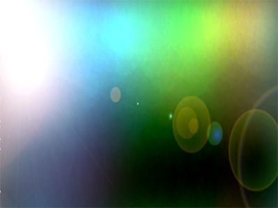
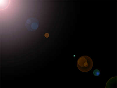
Lens flare.We want to add a lens flare to the image, but we don't want to modify the background itself. So, we create a new layer on the top, and fill it with pure black using the Paint Bucket Tool. Now, we use Filter > Render > Lens Flare... and put a nice lens flare in the upper left of the image. I used a 50-300mm Zoom with Brightness about 145%, but this is a matter of taste. Then, we set the lens flare layer to Screen with 100% opacity, and we have our lens flare which we can turn off at any time. Here is the lens flare layer set to Normal, before we set it to Screen: |
 |
Logo.Let's add the final (and main) touch - the Northwood logo itself. Let's create a new layer, and in it use the Type Tool to write "Northwood" in BankGothic Lt BT using 50% gray 250 point with Strong antialiasing. Then, using the Move Tool, we can move it to the center of the image (you can do this by eye, or measure the distance between the word and the edge of the image, etc). Now, let's change the layer to Color Dodge with 83% opacity. Great. (If you can like, you can do some effects here - I added a slight yellow glow, etc.) | |
| Now, we make another layer (on the top, as usual) and fill it with black. Then we make yet another layer and write the logo in pure white. We then Layer > Merge Down to get a black layer with white text. We set this layer to Multiply (see? We are being very tricky) and precisely position it pixel-by-pixel over the Color Dodged logo. (This may require a zoom to 200% or more - be careful.) If the image keeps snapping to the edges, turning off View > Snap will solve the problem. Now, we Select > All and Edit > Copy Merged. Now, delete (Layer > Delete Layer) both the white-on-black and the Color Dodge text layer. (Or wait to do this, in case mistakes are made later. Just turning off these layers' visibility will do.) | |
| Make a new 1600x1200 image (File > New) and paste the image in there. Layer > Flatten Image. Now, use the Rectangular Marquee Tool to select the colored logo and some black area around it - what you want is to NOT select any parts of the background which were revealed when you were moving the white-on-black Multiply layer around. Edit > Copy that, and close that image. Return to the wallpaper, and Edit > Paste to make a new layer. Set that layer to Screen, 100% Opacity. As you can see, now we have duplicated the trick I developed between the Northwood Logo Mark III and Mark IV - we have a solid logo with the color dodged effect! | |
Shadow.Now, we could just call it a day, add a drop shadow, and be done with it (if we had simply used the color dodged text layer to begin with; the special solid layer we just created cannot be drop shadowed in this fashion). Here's what the "R" would look like if the text were simply color dodged with a standard drop shadow: |
 |
| And here's the special shadow of mystery we will be creating: As you can see, we are about to create a very interesting and unique effect. It's actually so easy, I don't need to demonstrate it with pictures. All that we do is create twelve layers under the solid logo and type "Northwood" in a 50% gray. We set all the layers to Color Burn, and their opacities (from directly underneath the solid logo, down to right on top of the lens flare) to 30, 25, 25, 25, 20, 15, 10, 10, 8, 6, 4, 2. (Or whatever!) Then we move each successive logo one pixel down and one pixel to the right of the previous layer, creating the diagonal burn shadow. Whee! |
 |
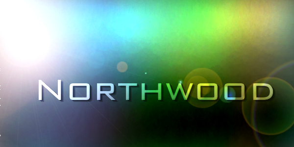
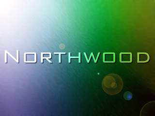
Final steps.We can then save our 1600x1200 master somewhere, and create a wallpaper by using Image > Image Size... to bicubic resize the image down to 1152x864 or whatever our desired resolution is (downsampling creates a better looking image; upsampling tries to fill in data where none exists, so always make your masters large). I used Kai's Photo Soap to enhance the colors in my wallpaper, but Image > Adjust > Auto Levels works almost as well. And thus we get the finished product: |
 northwood.zip (1600x1200, 2.91 MB) |
https://nuwen.net/wallpaper.html (updated a long time ago)
Stephan T. Lavavej
Home: stl@nuwen.net
Work: stl@microsoft.com
This is my personal website. I work for Microsoft, but I don't speak for them.